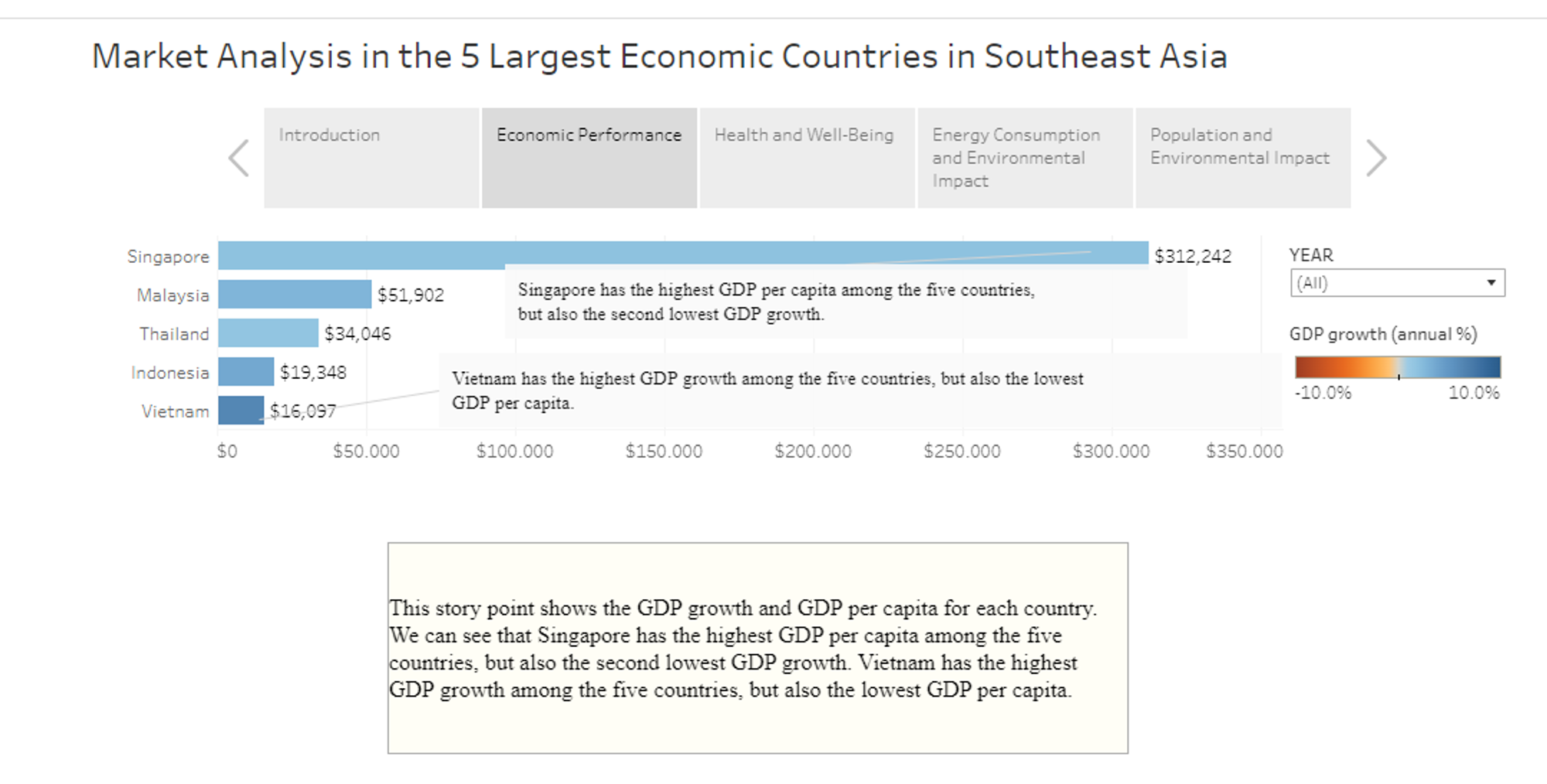
As a junior data analyst who is passionate about data, I've come to appreciate the power of data storytelling. Data alone can be overwhelming, but when you craft it into a compelling narrative, it becomes a tool for transformation and decision-making. In this blog post, I'd like to share my journey into the world of data storytelling using Tableau and how you can turn numbers into compelling narratives.
Step 1: Define Your Story
Every good story starts with a clear and concise message. Before diving into data visualization, define the story you want to tell. Consider:
- The Purpose: What message or insight do you want to convey through your data?
- The Audience: Who will be reading or interacting with your data story?
- The Data: What data do you need to support your narrative?
Step 2: Select the Right Visualizations
Once you've defined your story, choose the right visualizations to bring it to life. Tableau offers a wide range of visualization options, including:
- Bar charts: For comparing data or showing trends.
- Line charts: Great for illustrating change over time.
- Maps: Ideal for location-based stories.
- Scatter plots: Useful for showing relationships between variables.
- Pie charts: Good for displaying parts of a whole.
Remember that the choice of visualization should align with your story and make it more engaging.
Step 3: Data Preparation
Data storytelling starts with well-organized and clean data. Consider these aspects:
- Data Cleaning: Ensure that your data is free of errors, duplicates, and outliers.
- Data Aggregation: Summarize data as needed to support your narrative.
- Data Integration: Combine data from various sources to provide a holistic view.
Clean, well-structured data forms the foundation of a compelling data story.
Step 4: Add Context and Annotations
To guide your audience through the data story, provide context and annotations:
- Title and Subtitles: Use clear and concise titles to convey the main message.
- Captions and Annotations: Add notes and comments to help the audience understand key points within the visualization.
- Legends and Explanations: Provide explanations for any terms or concepts that might be unfamiliar to the audience.
Step 5: Interactive Elements
One of the advantages of Tableau is the ability to add interactivity to your visualizations:
- Filters: Allow users to explore data based on specific criteria.
- Parameters: Enable users to interact with the data by adjusting certain variables.
- Dashboard Actions: Create links between different visualizations to provide a seamless user experience.
Interactive elements help readers engage with the data and explore it on their own terms.
Step 6: Practice Empathy and Clarity
To craft a compelling data story, it's essential to practice empathy and clarity. Put yourself in the shoes of your audience and ask:
- Is the message clear?
- Is the story engaging?
- Is the data presented in a user-friendly manner?
Remember that a good data story is not just about data; it's about connecting with your audience and conveying meaningful insights.
In Conclusion
Data storytelling is an art that adds a human touch to numbers and statistics. With Tableau, you have a powerful tool at your disposal to turn data into compelling narratives. Through clear definitions, thoughtful visualizations, clean data, annotations, interactivity, and empathy, you can create stories that not only inform but also inspire action.
Feel free to personalize this content with your own experiences, examples, or any additional information you'd like to include to make it your own.
