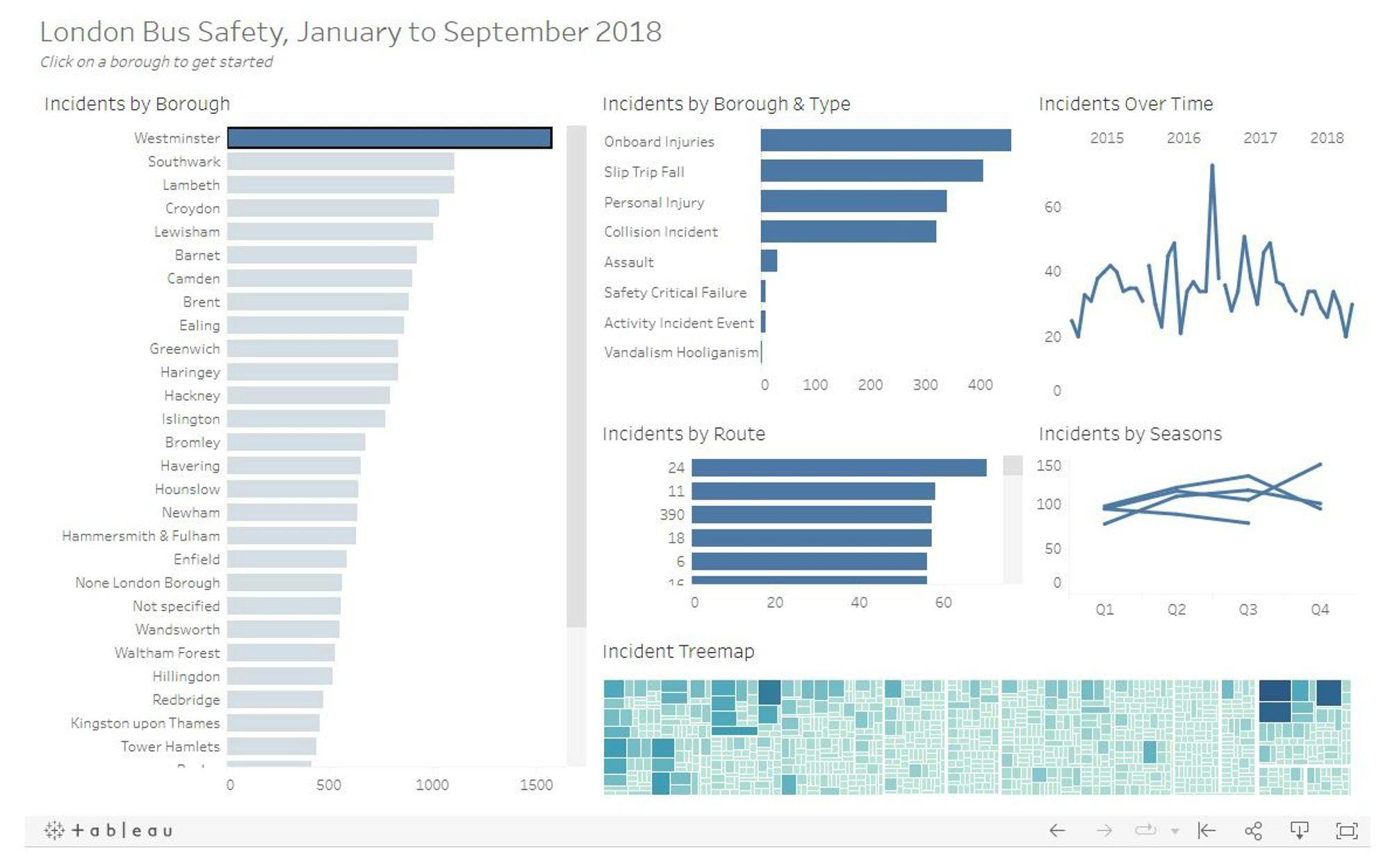
As a junior data analyst on a journey to master Tableau, one of the most exciting aspects I've discovered is the ability to create interactive dashboards. These dashboards not only make data more engaging but also empower users to explore data on their terms. In this blog post, I want to share a step-by-step guide on how to create interactive dashboards in Tableau, just as I've learned to do.
Step 1: Plan Your Dashboard
Before diving into Tableau, take some time to plan your dashboard. Think about the key questions you want to answer and the audience you're creating it for. Consider:
- What data do you want to display?
- What is the primary message or insight you want to convey?
- How can interactivity enhance the user experience?
Step 2: Connect Your Data
Begin by connecting your data source in Tableau. Import your dataset or connect to a database, spreadsheet, or cloud service. To create an interactive dashboard, make sure your data is well-organized and structured.
Step 3: Design Your Dashboard Layout
In Tableau, you have full control over the layout and design of your dashboard:
- Use the "Layout" tab to arrange your sheets, objects, and filters.
- Consider the placement of titles, headers, and other explanatory elements.
- Choose a color scheme that complements your data and ensures readability.
Step 4: Build Visualizations
Create the visualizations you want to include in your dashboard. Use different chart types, maps, and graphs to present your data effectively. Remember to:
- Add filters, parameters, and actions to make visualizations interactive.
- Use the "Show Me" feature to explore different visualization options.
- Ensure consistency in style and colors across all visuals.
Step 5: Add Interactivity
The magic of an interactive dashboard lies in adding elements that allow users to explore and drill down into data. Consider:
- Dashboard Actions: Create actions that link different dashboard elements. For example, clicking on a chart can filter data on a map.
- Parameters: Parameters enable users to change specific aspects of a visualization, providing a more personalized experience.
- Filter Controls: Include filter controls to allow users to narrow down data based on specific criteria.
Step 6: Test and Refine
Before sharing your interactive dashboard, thoroughly test it to ensure everything works as intended. Look for:
- Broken actions or filters.
- Data inconsistencies or inaccuracies.
- User-friendliness and clarity of instructions.
Step 7: Share Your Dashboard
Now that your interactive dashboard is ready, it's time to share it with your intended audience. You have a few options:
- Tableau Server or Tableau Online: Publish your dashboard to Tableau Server or Tableau Online for easy and secure sharing within your organization.
- Tableau Public: If you're looking to share your work with a broader audience, consider using Tableau Public. It's a free platform for publishing and sharing dashboards publicly.
In Conclusion
Creating interactive dashboards in Tableau is a rewarding experience. It's a chance to breathe life into your data and allow users to discover insights on their own. With a well-thought-out plan, a creative approach to design, and some practice, you can master the art of interactive dashboards and make your data analysis truly engaging.
Feel free to personalize this content with your own experiences, examples, or any additional information you'd like to include to make it your own.
